EQX: Fitness App
EQUINOX:
A Content Platform Focusing On Form & Function
Objective: Establish a visual identity synonymous with Equinox Fitness for the launch of their first-ever coaching application—while considering production feasibility, scalability and best-in-class experiences within the fitness application arena.
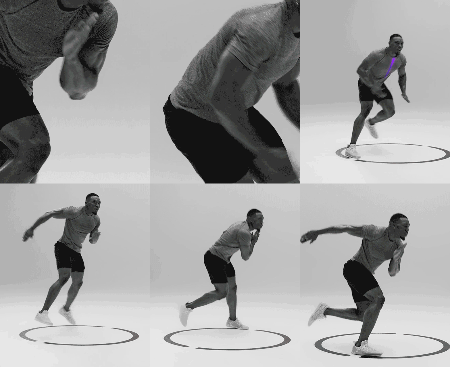
Solution: A scalable brand treatment emphasizing each trainers form, movement and muscles. Shot in studio, we used lighting and line—a reference to the Equinox logo—to convey a discernible sense of space. Instructors use these physical lines to aid in instruction. Cinematography was inspired by Greek and Roman sculpture, which closely studied and celebrated the human form from varying angles—a body study. The black and white photographic treatment encourages users to focus on movement over environmental detail. Taking inspiration from da Vinci’s Vitruvian Man, colored graphic lines are layered onto instructors movements drawing users attention to specific details—Mastery of Movement.
Scope: Content Strategy, Art Direction & Application UI Framework
Emphasizing Alignment & Precision
Colored lines and dynamic graphics draw users’ attention to key instructions throughout workouts. Graphic device is used as a through-line across all assets, workouts and materials. Colors are drawn from the EQX brand book and speak to stages of the work out, such as red and orange for active segment, blue and purple for rest and rejuvenation.
Director: Brendan Dacey
Director of Photography: Garrett Hardy Davis
Editor: Juan Palacios
Agency: Spring Studios


